
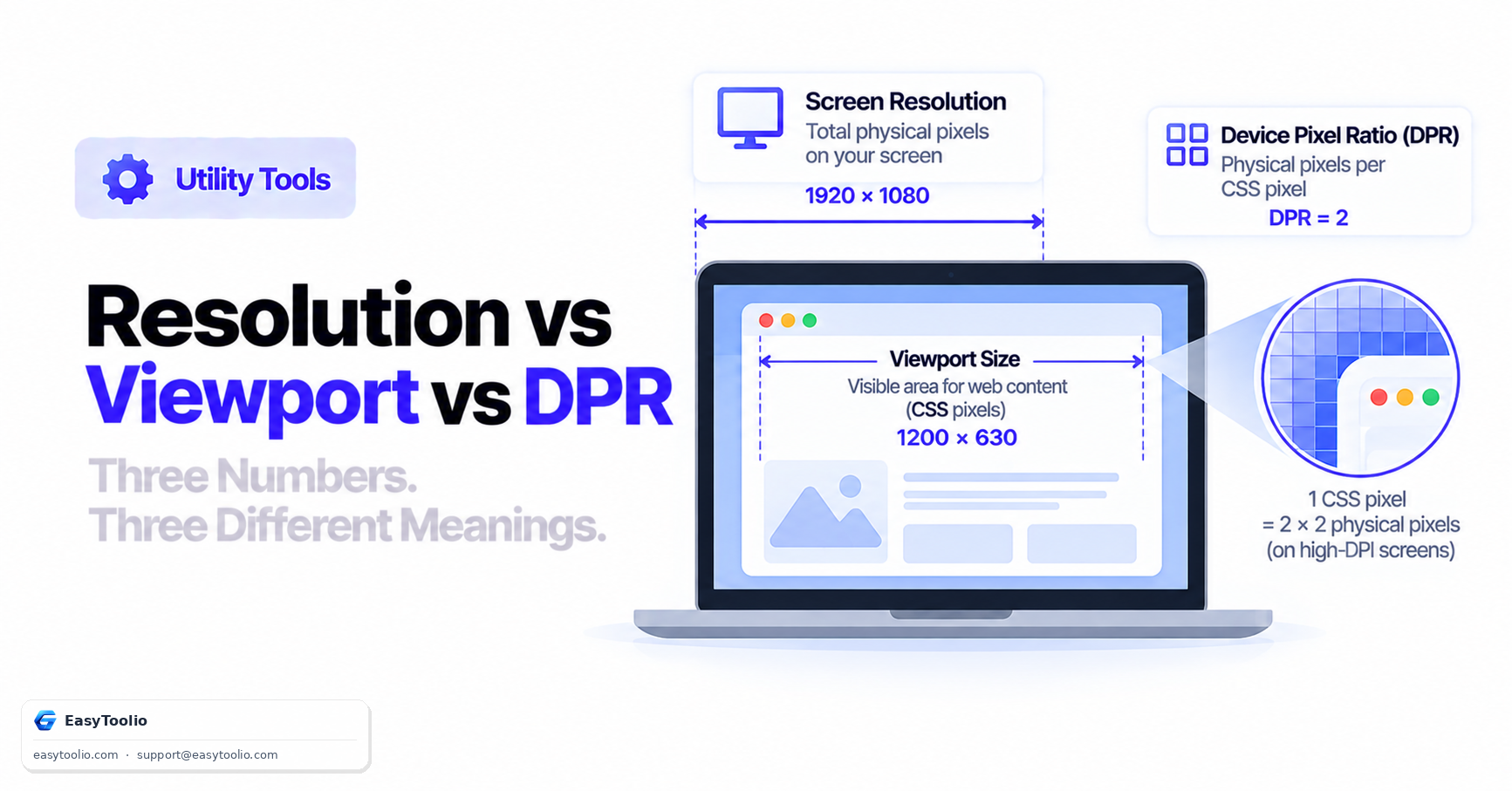
When designing responsive websites, front-end developers frequently run into three related but distinct display metrics: physical screen resolution (e.g. 2560×1440 hardware pixels), CSS viewport size (e.g. 1280×720 logical pixels), and device pixel ratio (e.g. 2.0×). Confusing these three is one of the most common sources of blurry images and broken responsive layouts.
Direct Answer: Physical screen resolution is the total count of actual hardware pixels on a display panel. CSS viewport size is the logical coordinate space browsers use to lay out web pages, measured in CSS pixels rather than hardware pixels. Device pixel ratio (DPR) is the scaling factor that maps physical hardware pixels to CSS logical pixels:
DPR = Physical Hardware Pixels ÷ CSS Logical Viewport Pixels
Why These Three Numbers Diverge
Early displays had a 1:1 relationship between hardware pixels and CSS pixels — a "1080p monitor" showed a 1920×1080 CSS viewport, matching its hardware resolution exactly. High-density "Retina" and "HiDPI" displays broke that assumption on purpose: they pack far more physical pixels into the same physical screen size for sharper text and images, while reporting a smaller, unchanged CSS viewport so that existing web layouts don't shrink to illegibility. The browser then uses the DPR to decide how many physical pixels to draw for each logical CSS pixel.
Display Metrics Comparison
| Device Example | Physical Resolution | CSS Viewport | Device Pixel Ratio | Recommended Asset Resolution |
|---|---|---|---|---|
| Standard 1080p monitor | 1920 × 1080 | 1920 × 1080 | 1.0× | Standard (1×) images |
| MacBook Pro 16" Retina | 3456 × 2234 | 1728 × 1117 | 2.0× | @2x high-DPI images |
| iPhone 15 Pro | 1179 × 2556 | 393 × 852 | 3.0× | @3x high-DPI images |
| Standard Android phone (~2.6× class) | ~1080 × 2400 | ~412 × 915 | ~2.6× | High-DPI images scaled to match |
Worked Example: Calculating Physical Pixels From CSS Viewport
Take a MacBook Pro reporting a CSS viewport width of 1728px and a device pixel ratio of 2.0:
Physical pixel width = CSS viewport width × DPR = 1728 × 2.0 = 3456 physical pixels
This is exactly why a logo image exported at 200×200 physical pixels looks crisp on a 1.0 DPR monitor but noticeably blurry on a 2.0 DPR Retina display — the browser has to upscale that 200×200 image to fill a 200×200 CSS pixel box, which on a 2.0 DPR screen actually needs 400×400 physical pixels of source detail to render sharply.
Reading Viewport Metrics in JavaScript
const cssViewportWidth = window.innerWidth;      // logical CSS pixels
const devicePixelRatio = window.devicePixelRatio; // e.g. 2.0
const physicalPixelWidth = cssViewportWidth * devicePixelRatio;

console.log(`CSS viewport: ${cssViewportWidth}px, DPR: ${devicePixelRatio}, Physical: ${physicalPixelWidth}px`);
Note that window.innerWidth includes the viewport minus browser chrome, while screen.width reports the full physical display's CSS-pixel-equivalent width — a subtly different number that's easy to mix up.
Targeting High-DPI Displays in CSS
/* Serve a higher-resolution image only to high-DPI screens */
.logo {
  background-image: url('logo.png');
}

@media (-webkit-min-device-pixel-ratio: 2), (min-resolution: 192dpi) {
  .logo { background-image: url('logo@2x.png'); }
}
Modern responsive images can also let the browser choose automatically, without a media query at all:
<img src="logo.png" srcset="logo.png 1x, logo@2x.png 2x, logo@3x.png 3x" alt="Company logo">
The srcset approach is generally preferred over CSS media queries for images specifically, because the browser can factor in both DPR and network conditions (choosing a lower-resolution image on a slow connection even on a high-DPR screen) — something a pure CSS media query cannot do.
Common Confusions and Pitfalls
- "My site looks fine on my monitor but blurry on my phone." Usually means images were sized for a 1.0 DPR viewport without
@2x/@3xvariants, so higher-DPR devices upscale them. - "Why does my 4K monitor report such a small viewport?" Operating system display scaling (e.g. Windows set to 150% or 200%) intentionally shrinks the reported CSS viewport to keep text and UI elements legible, effectively raising the DPR the OS reports to the browser.
- "
window.innerWidthandscreen.widthgave me different numbers."window.innerWidthis the browser window's current viewport;screen.widthis the entire physical display's width in CSS pixels — they only match when the browser window is maximized on a single monitor. - Confusing viewport
metatag width with actual CSS viewport. The<meta name="viewport" content="width=device-width">tag tells mobile browsers to set the CSS viewport equal to the device's ideal viewport width, but this is a hint the browser applies, not a raw hardware measurement.
Why This Matters for Responsive Design
- Image sizing: serving 1× images to a 3× DPR device wastes no bandwidth but looks soft; serving 3× images to a 1× DPR device wastes bandwidth for no visual benefit. Responsive
srcsetsolves both directions at once. - Layout breakpoints: CSS media queries should be written against the CSS viewport (what
window.innerWidthreports), not physical resolution — a phone with a 3× DPR and a tablet with a 2× DPR can report similar CSS viewport widths and should receive similar layouts. - Touch target sizing: touch targets need to be sized in CSS pixels for consistent physical tap-target size across devices with wildly different DPRs, since a "44px" button is the same finger-friendly physical size on both a 1× and a 3× DPR screen.
Check your own display's physical resolution, CSS viewport, and DPR scaling instantly using our screen resolution checker, inspect detailed browser parameters via browser info, parse client headers in the User-Agent parser, and run a full hardware and display audit with the full device check.
Frequently Asked Questions
Why does a 4K monitor set to 150% scaling report a lower CSS viewport?
Operating system scaling increases text and UI readability by mapping multiple physical pixels to each logical CSS pixel, which shrinks the reported CSS viewport size even though the physical resolution stays the same.
What device pixel ratio should I design for by default?
Design layouts fluidly using CSS units (rem, %, viewport units) rather than targeting a specific DPR. For image assets, provide at least 1×, 2×, and 3× variants via srcset so the browser can select the appropriate one automatically.
Is device pixel ratio the same as screen DPI?
They're related but not identical. DPR is a browser-reported scaling factor relative to a CSS pixel baseline; DPI (dots per inch) is a hardware measurement of physical pixel density. A browser derives its reported DPR partly from the display's DPI and partly from OS-level scaling settings.
Does viewport size change when the on-screen keyboard opens on mobile?
Yes, on many mobile browsers the visual viewport shrinks when the keyboard appears, which can trigger layout reflows. Modern browsers expose a separate visualViewport API specifically to let developers distinguish this case from an actual window resize.
Can I detect a user's exact physical screen size in inches?
Not reliably. Browsers expose pixel dimensions and, indirectly, DPR, but not the physical panel size in inches, since that would require accurate hardware reporting that varies or is unavailable across devices and operating systems.
References: W3C CSS Values and Units Module Level 3 (CSS Pixels Definition).